
Student learningfor Grades 3–5
Ad or Info?
Students sort mock posts, videos, and headlines into ads, information, and clickbait, hunt for persuasion tricks, and then create an honest, clearly labeled ad of their own.
All activities Student learning
Students turn a lunch survey into a spreadsheet or paper grid, compute counts and averages, build an honest chart, then catch and fix charts (and an AI chart suggestion) that mislead with a truncated axis or a cherry-picked range.
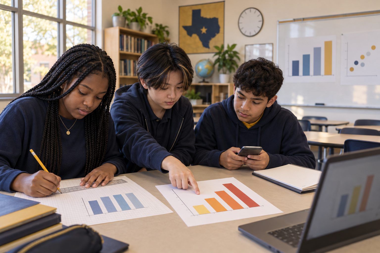
Charts show up everywhere students look: school newsletters, ads, news stories, social posts, and more and more often, AI tools that offer to "make a chart for you." In this lesson, students become the data team for the fictional Cedar Ridge Middle School cafeteria. They enter 24 survey responses into a spreadsheet (or a paper grid), count favorites and average the menu ratings, and draw an honest chart. Then they meet two flashy charts that use the same kind of data to tell a misleading story, one with a truncated axis and one with a cherry-picked range, plus a confident AI chart suggestion that gets the math wrong. Students fix each one and write a rule they can use whenever a chart tries to persuade them.
Hook
Reveal your board sketch of Chart 1: two bars, Pizza towering over Tacos, and the headline "Pizza CRUSHES Tacos!" Ask: "Thumbs up if you believe the headline. How many more students do you think picked pizza?" Most will guess double or more. Say: "Hold on to that guess. By the end of class, you'll know exactly how many, and you'll know the trick that made it look that way."
Facilitator noteDon't reveal the axis trick yet. Let students discover it after they've made their own chart from the real numbers.
Explore
Pairs enter Handout A into a spreadsheet (or copy it onto grid paper). Then they compute, and record on Handout C: how many students picked each lunch item, the average (mean) menu rating, the median rating, and how many rated the menu 4 or 5. In a spreadsheet, show the formulas most apps use, such as =COUNTIF(C2:C25,"Pizza") for a count and =AVERAGE(D2:D25) for the mean. On paper, students tally and divide. Pairs compare with another pair and fix any differences.
Facilitator noteAnswer key: Pizza 8, Tacos 7, Pasta 4, Salad bar 3, Sandwich 2 (24 total). Ratings add to 81, so the mean is 81 ÷ 24 = 3.375, about 3.4. The median is 3.5. Twelve students (half) rated the menu 4 or 5. Pairs that disagree usually mistyped a row, which is its own lesson: check your data entry.
Create
Pairs make a bar chart of favorite lunch items (spreadsheet chart tool or hand-drawn on grid paper). The chart must have: a vertical axis that starts at 0, labeled axes, a count shown on or above each bar, and a title that says what the data shows without exaggerating (for example, "Favorite Lunch Items, 24 Students Surveyed"). Ask: "Now look at Pizza and Tacos. How big is the difference really?" (One student.)
Facilitator noteSome spreadsheet apps choose an axis starting point automatically. If a pair's chart doesn't start at 0, that's a perfect teachable moment: show them where the axis minimum setting is.
Practice
Pairs read Parts 1 and 2 of Handout B. For each chart, they answer on Handout C: What story does the chart want me to believe? What trick makes it look that way? What does the full, honest data show? Then they redraw one of the two charts honestly, using the data given. Bring the class together and name the two tricks: a truncated axis (the axis starts above zero, so small differences look huge) and a cherry-picked range (only the part of the data that supports the story is shown).
Facilitator noteChart 2 is the harder one: the last five days really did go up. The chart isn't lying about those days. It's leaving out the three weeks before, when checkouts fell. Weekly averages: 46.8, 40.4, 34.4, 35.4.
Apply
Pairs read Part 3 of Handout B, a chatbot's suggestion for charting the survey. Using their own calculations, they mark every claim as correct, wrong, or misleading, and write the correction. Debrief: "The chatbot sounded sure. How did you know it was wrong? Who's responsible if a wrong chart gets published, the chatbot or the person who posted it?"
Facilitator noteErrors to catch: the average is about 3.4, not 3.9; half of students (not 75%) rated the menu 4 or 5; Pizza is the most common favorite but only 8 of 24 (one-third), not "most students"; starting the axis at 6 is the same truncated-axis trick. The pie chart suggestion is a judgment call; a bar chart of ratings is easier to compare.
Reflect
Students complete the last section of Handout C: a three-part rule they'll use whenever a chart tries to persuade them, and one sentence about when an AI tool might help with a chart and what they would check first. Share a few rules aloud and build a class poster, such as "Check the axis. Check the range. Check the math."
Facilitator noteEvidence to collect: the redrawn chart and the corrected chatbot claims show whether students can do the checking, not just name the tricks.
Everything works on paper: students copy the survey onto grid paper, tally counts, compute the average with a calculator or by hand, and draw bar charts with rulers. For a moving version, have students stand in lines by favorite lunch item to form a human bar chart, then have a volunteer hold a paper "axis" that starts at 6 while the class notices how the picture changes.
Pairs enter the data in a spreadsheet app with school-managed accounts, use COUNTIF and AVERAGE formulas, and insert a bar chart. Then they deliberately change the vertical axis minimum to 6 and watch the chart turn into the misleading one, and change it back. For the AI step, the teacher projects a district-approved chatbot, pastes the survey data, and types: "What chart should I make from this lunch survey, and what does it show?" The class checks the live answer against their own calculations, just as they did with Handout B. Students under 13 never use their own AI accounts.
Does it need a screen? The spreadsheet earns its screen time here: students see a formula recompute instantly when they fix a typo, and they can flip an axis setting and watch an honest chart become a misleading one, which makes the trick concrete in a way a drawing cannot. The live AI check adds evidence that students verify machine output against their own math instead of trusting it.
What you should be able to see or collect if it worked.
Students compute and chart survey data in a spreadsheet, then detect and correct misleading axes, cherry-picked ranges, and a flawed AI chart suggestion.
At home, students find one chart or graph in a flyer, ad, or news story with a family member and check it with the class rule: the axis, the range, and the math. Next lesson, students use the same spreadsheet skills to chart data from a science investigation or a class poll, and explain why their chart is honest.