Activity Bank
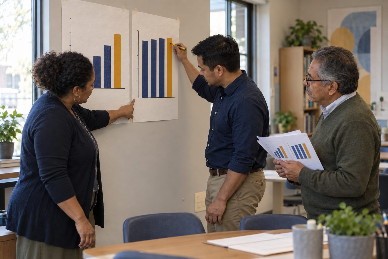
Three education leaders redraw a misleading bar chart on chart paper so its baseline starts at zero.

All activities Professional learning

Read the Dashboard Before It Reads You

Leaders take apart eight mock dashboard panels, including an AI-generated "insight," to practice asking what the data shows, what it can't show, and who could be harmed by a hasty conclusion.

Print handouts

Overview

Dashboards arrive with confidence: colors, arrows, and increasingly, automatically generated "insights" written in plain English. Leaders are expected to act on them. In this session, teams read eight fictional dashboard panels with the same critical eye they'd teach students to bring to an infographic: checking axes, baselines, sample sizes, what the metric actually measures, and what the data can't tell you. They also examine what personal data each panel exposes and to whom. Teams finish by redrawing one misleading panel honestly and writing a three-sentence summary a staff meeting could trust.

Objectives

  • Participants will identify at least four ways a data display can mislead (truncated axes, missing baselines, small samples, proxy metrics, correlation presented as cause).
  • Participants will distinguish what a data panel shows from what it cannot show, and name the additional evidence needed before acting.
  • Participants will evaluate the privacy implications of who can see which student data on a dashboard.
  • Participants will redraw one misleading display and communicate its finding accurately in three sentences.

Materials

On paper

  • Handout A: Dashboard Panel Cards (1 set per team, cut apart)
  • Handout B: Can / Can't Tell Organizer (1 per team)
  • Handout C: Dashboard Data Use and Privacy Checklist (1 per person)
  • Graph paper or blank paper, rulers, colored pencils for redrawing

On screen

  • Optional: access to a real dashboard your campus uses, with student-identifying information hidden or a demo account
  • Optional: a spreadsheet with the Panel 1 numbers so teams can redraw charts digitally

Before you start

  1. Print and cut Handout A. The panels are described in words so they print cleanly; if you want visuals, sketch Panels 1 and 3 on chart paper as described.
  2. If you plan to use a real dashboard in the Reflect step, check who is permitted to see it and hide student names. A training session is not a reason to widen access to student data.
  3. Copy the Panel 1 numbers into a spreadsheet if you want teams to redraw digitally.

Step by step

  1. 10–6 min

    Hook

    The alarming chart

    Sketch Panel 1 on chart paper exactly as described: a bar chart where the y-axis starts at 80%. Ask: "If this were on the screen at a board meeting, what would people conclude?" Then redraw the axis starting at 0% right next to it. Ask: "Same data. What changed?"

    Facilitator notePeople usually say attendance "collapsed." The actual drop is about three percentage points. Both charts are accurate; only one is honest about scale.

  2. 26–24 min

    Explore

    Panel stations

    Teams rotate through the eight panels (or work through them at their table), spending about two minutes each. For each panel they fill a row of Handout B: the claim someone might make, what the panel actually shows, what it can't tell us, and the next question or data needed. They also mark any panel that exposes personal information to people who may not need it.

    Facilitator notePanel 5, the AI-generated insight, tends to spark the biggest debate. Ask: "What data could the software actually have used to decide students are 'disengaged'?"

  3. 324–34 min

    Debrief

    Name the moves

    Build a class list on chart paper titled "Questions to ask any dashboard" from what teams found: What's the baseline? How many students is this? What is this metric actually counting? Could something else explain it? Who can see this, and do they need to? Compare with the facilitator key on the card backs.

    Facilitator noteConnect to media literacy: these are the same questions students should ask about a viral infographic. Leaders who model them teach them.

  4. 434–48 min

    Create

    Redraw and rewrite

    Each team chooses one misleading panel and (1) redraws it honestly on paper or in a spreadsheet, and (2) writes a three-sentence summary for a staff meeting: what the data shows, what it can't tell us, and what we'll look at next. Post the redrawn charts.

    Facilitator noteLook for summaries that include uncertainty without drowning in it. "We don't know yet, and here's how we'll find out" is a leadership sentence.

  5. 548–55 min

    Reflect

    Privacy and use check

    Each person completes Handout C for a dashboard they actually use. Pairs compare and each names one access or display change they'll ask about, for example who can see individual student names, or whether an AI-generated label appears in a place families or other students can see it.

    Facilitator noteUnder FERPA, access to student records generally should be limited to school officials with a legitimate educational interest. Your district's policy details matter; check them rather than guessing.

  6. 655–60 min

    Transfer

    Next data conversation

    Each person writes the one question from the class list they'll ask at their next data meeting, and who they'll ask it of.

    Facilitator noteSuggest leaders post the "Questions to ask any dashboard" list in the room where data meetings happen.

Paper or screen

Unplugged

All eight panels are described in words on printed cards, and teams redraw charts on graph paper. The facilitator can sketch the key panels on chart paper. No device is needed to learn to question a chart.

Digital

Give teams the Panel 1 numbers in a spreadsheet and have them create two charts, one with a truncated axis and one honest, to see how easily defaults mislead. If your campus has a demo account or anonymized view of a real dashboard, use it for the Reflect step. In a virtual session, share panels as slides and have teams complete Handout B in a shared document.

Does it need a screen? Building the misleading chart and the honest one from the same numbers in a spreadsheet shows, in under a minute, how a single axis setting changes the story. Paper can explain that; the spreadsheet lets leaders feel it.

Evidence of learning

What you should be able to see or collect if it worked.

  • Handout B names a specific missing baseline, sample size, or alternative explanation for at least four panels.
  • Teams identify that the AI-generated insight in Panel 5 is based on a proxy (login minutes) and question labeling students from it.
  • Redrawn charts start at an appropriate baseline and the three-sentence summaries include what the data cannot tell us.
  • Participants name at least one concrete change to who can see student-level data.

Adaptations

Higher Ed
Recast the panels as course success rates, learning management system logins, and an early-alert system's AI-generated "at-risk" flags. Emphasize how students are notified when flagged.
Coaches
Use the panels in a PLC data meeting, and have teachers redraw a chart from their own class data before discussing it.
Board or community audiences
Use only Panels 1, 3, and 4, and focus on the "can't tell us" column as a model for public data reporting.

Standards connections

Leaders spot truncated axes, small samples, and proxy metrics, then redraw a chart honestly, the same data-representation and privacy skills they want students to apply.

TEKS
data literacy, management, and representationprivacy, safety, and security (c)(10)TEKS sections: Technology Applications §126.5–§126.7, §126.8–§126.10, §126.17–§126.19, high school Technology Applications courses (19 TAC Chapter 126)

See how all activities align

Reflect

  • How am I using digital tools and data analytics to drive school improvement efforts and decision-making? (Leader ELE 3.0)
  • When did a chart or dashboard last change my mind, and did I check it first?
  • What are the limitations and potential biases of AI-generated summaries of student data? (AI ELE 1.3)
  • How do I communicate uncertainty in data to staff and families without losing their trust?

Take it to your students

At your next data meeting, ask one question from the class list before any decision is made, and present one chart with its "what this can't tell us" note beside it. Review who has access to your campus dashboards with your data privacy contact this month.

Pairs well with